In the initial macOS Tahoe beta, Apple swapped the colors of the Finder icon, a longtime Mac classic. Rather than featuring blue on the left side of the face and light blue on the right side, the icon was primarily white and the right side of the face was blue.
macOS Tahoe Finder icon in beta 2The updated Finder look was a significant deviation from the design that Apple has used for Finder since 1996, and many Mac users were unhappy with the change. Apple had tweaked the Finder colors and design slightly over the years, but the first Tahoe beta marked the first significant change that we’ve seen because of the decision to put the darker color on the right.
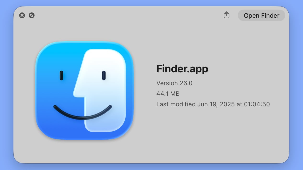
Apple has now reverted the Finder icon to a more traditional color scheme, while keeping the Liquid Glass look. The left side of the face is blue, while the lighter side is a white/blue gradient that has a layered, glass-like appearance.
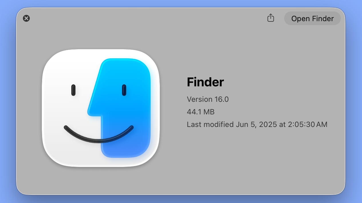 macOS Tahoe Finder icon in beta 1
The icon isn’t the same as the version in macOS Sequoia because it doesn’t use an even color split, but it’s much closer to the original design while still looking fresh.
This article, “macOS Tahoe Beta 2 Brings Back Classic Finder Color Scheme” first appeared on MacRumors.com
Discuss this article in our forums
Featured, macOS Tahoe 26
MacRumors: Mac News and Rumors – All Stories
[crypto-donation-box type=”tabular” show-coin=”all”]